In our article What are Trading Charts? — Part 1 we looked at how various trading charts work, why they’re important, how to read live charts and how to use them. Plus, we covered when charts should be used and what to consider when trading using charts.
In this article, we explore the different types of trading charts including; bar, candlestick, line, Heiken-Ashi, Renko and the tick chart.
Construction of a Trading Chart
Before we jump into types of charts, you should know the two primary inputs that go into constructing a trading chart. Price and time. The price itself could include four different aspects – the open, high, low and close in any particular timeframe. Price and time are the most common but other inputs include volume and possible (but rarely) open interest (when looking at futures trading charts).
How Many Types of Trading Chart Are There?
There are lots of types of trading chart. Below is a comprehensive list of the many different types of trading charts.
- Bar chart
- Candlestick chart
- Line chart
- Heiken Ashi
- Renko
- Tick chart
- Point & Figure
- Market Profile
- Candlestick chart
- Candle Volume
- Area chart
- Volume chart
- Volume at Price (VAP)
- EquiVolume
- Range Bar
- Kagi
- Three Line Break
- High Low Close Bar
- Open High Low Close Bar
- Mountain chart
We’re now going to look at the first six in more detail because they’re the most popular; the bar chart, candlestick chart, line chart, Heiken Ashi, Renko and tick charts.
What Are the Most Commonly Used Trading Charts?
The most commonly used trading charts for analysis are bar charts and candlestick charts. Line charts aren’t used for analysis but are more popular for display purposes, for journalistic purposes and in reports. The Japanese Heiken Ashi and Renko charts have become more prevalent in the 21st century, with Heiken Ashi a development of candlestick charts, while Renko charts are similar to Point and Figure charts.
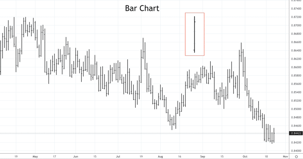
Bar Chart
The bar chart is also known as the Open High Low Close (OHLC) chart. That’s because it’s made up of these four price points in any time frame. The formation of the bar chart is as follows.
- High – The bar chart consists of a vertical line for any timeframe. The top of the vertical line, or bar, shows you the highest price the market traded in that period.
- Low – The lower end shows you the lowest price in the period.
Two small horizontal lines make up the bar chart. - Open – The opening price in the period is marked by the horizontal line to the left of the vertical line.
- Close – The closing price is indicated by the horizontal line to the right of that line.
Normally, if the close is above the opening price, the entire bar is coloured green, while if the close is below the open, the whole bar is red. The colours are dependent on the platform and your preference but traditionally green is a bar moving up and red is a car moving down in price.
The location of the open and close relative to each other and also relative to the high and close can give you valuable insights. Furthermore, if the bars are colour coded, it can provide you with quick and easy information about the direction of the market.
Bar charts are similar to candlestick charts because they display the same price information. Some candlestick analysts will argue that they give you more insight than a bar chart. Therefore, better when using technical analysis. What they can be is more visual, which can help but ultimately it comes down to your preference. There’s no right answer.
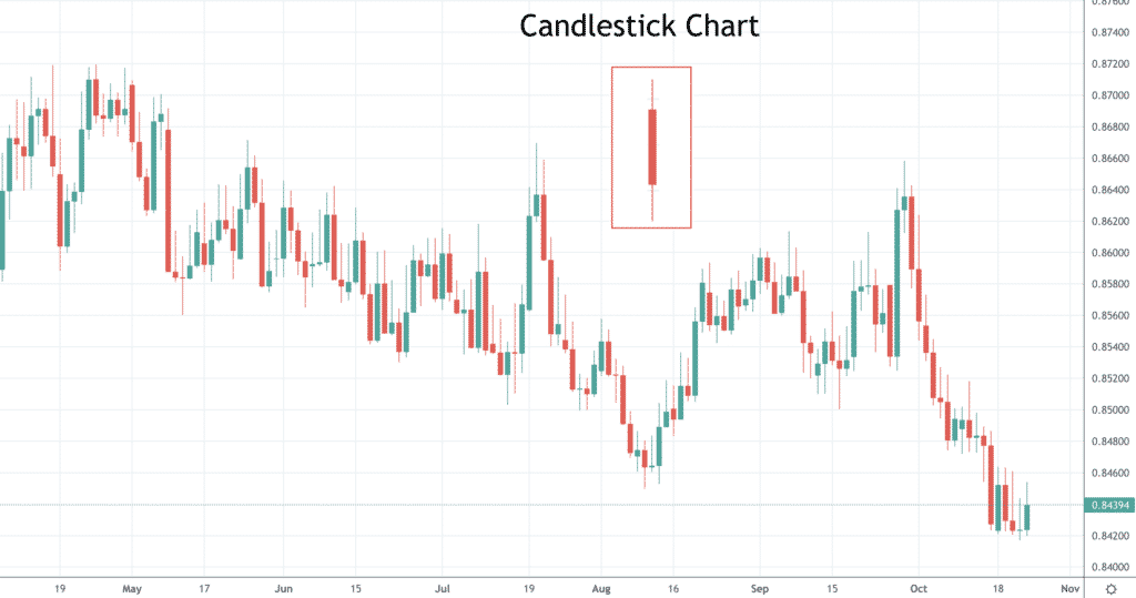
Candlestick Chart
Developed in Japan in the 18th century by Honma Munehisa, candlestick charting has a long history. Munehisa was a hugely successful trader on the rice futures market that had developed in Osaka, Japan, during the early 18th century. In today’s money, the market would be worth over $100bn. Munehisa is said to have written lots of books on financial markets and trading, which covered his strategy of candlesticks charts.
The formation of the candlestick chart is as follows.
- High and low – As with the bar chart, the high and low of any time frame are plotted as the upper and lower extremes that make up the candlestick chart.
- Open and close – The area between the open and close is a broader area when displayed and is known as the ‘body’ or ‘real body’.
If the closing price is higher than the opening price, then this area is usually a hollow candlestick (white with a black outline) or is green. If the closing price is lower than the opening price, then this area is usually a filled candlestick (black) or red.
As mentioned above, the vertical lines above and below the ‘body’ or ‘real body’ are known as the ‘shadows’. The upper ‘shadow’ that marks the high of the period is often described as the ‘wick’, while the lower ‘shadow’ that marks the low of the period is often described as the ‘tail’.
The differing configurations of open, high, low and close, therefore, produce different shapes or patterns. In our section on using candlestick charts, we go into more detail about their formations and how to use them to trade.
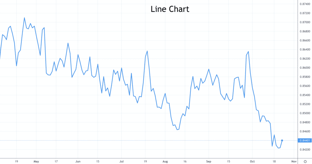
Line Chart
The line chart is very simple. It joins single price points for any period, over a specific timeframe. It shows the path of the price action, the journey of the market as a single line. Usually, the price point is the close of any period, each hour, day, week, etc. But that doesn’t have to be the case. The price could be the open, the high or low of the period, then joined together to form a single line graph.
Generally speaking, the line graph is not used for analysis as it contains far less information than the bar or candlestick charts. The line chart is more often used in a report or article, by strategists, economists or journalists. It is rarely employed by technical analysts, or traders using the technical analysis approach.
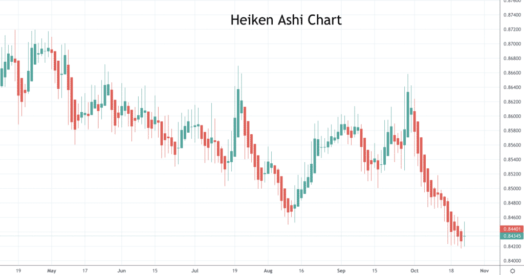
Heiken Ashi Chart
The Heiken Ashi chart shows similar, but different information than that of candlestick charts. Heiken Ashi translated from Japanese means ‘average bar’. The Heiken Ashi formulae are used to create new ‘average’ prices for the open, high, low and close. Then these are displayed similar to a candlestick chart. Below are the formulae used to create the new levels.
Heiken Ashi open (HAO) = (Open of previous bar + Close of previous bar) / 2
Heiken Ashi close (HAC) = (Open + High + Low + Close) / 4
Heiken Ashi high (HAH) = Highest of High, Open, or Close
Heiken Ashi low (HAL) = Lowest of Low, Open, or Close
The main advantage is that Heiken Ashi charts are a much smoother chart, which helps you identify the trend. However, do note that Heiken Ashi charts don’t show the actual current price, or the real highs or lows. It’s recommended that Heiken Ashi charts be used in conjunction with a bar or candlestick chart.
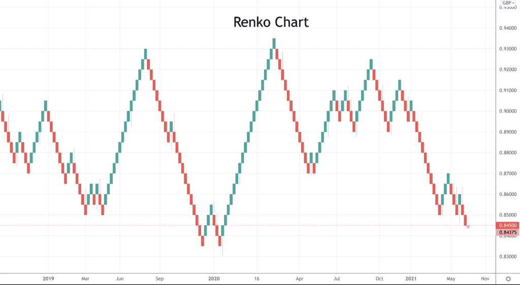
Renko Chart
The Renko chart is again a Japanese type of trading chart and is similar to the western Point and Figure charts, in that there is not a uniform time interval as with most types of trading charts. The name derives from the Japanese word ‘renga’ meaning bricks because the chart appears as a sequence of bricks. The size of each ‘brick’ is defined by the trader/ analyst. When the price moves the specified amount of the brick, a new brick is created, above or below the previous brick (45-degrees), not on the same line. Although there is a time axis, the time interval is not fixed.
Like the Heiken Ashi charts, Renko charts smooth the price action and filter out ‘noise’ in the market. The Renko chart is also useful in recognising significant support and resistance levels. With Renko charts, some of the price action is lost, so they are not as useful for some types of traders.
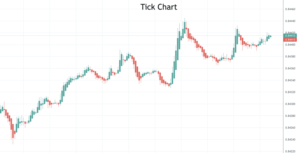
Tick Chart
Somewhat simplified, the tick chart shows a new bar after several transactions (or trades), rather than after a length of time. The analyst or trader defines the number of transactions. So instead of a new bar starting after a specific time, it starts after a number of transactions. As with the bar chart, the open, high, low, and closing prices are defined, but usually on tick charts, the open is not shown, just the high, low and close. The advantage of using a tick chart is that it shows when a market is very active or less volatile. The interval for tick charts, the number of transactions, is often based on Fibonacci numbers. Very short-term traders are the main users of tick charts.
Our next section of the course on technical analysis will help you understand the sometimes-tricky concept of timeframes in trading.
