Below we provide a glossary of key Technical Analysis terms. These range from the basic, through intermediate, to more advance terms used in the Technical Analysis approach to markets.
Here we start with those terms beginning A through to P. You can click on a letter to find your section quicker.
A – B – C – D – E – F – G – H – I – L – M – O – P – R – S – T – W
A
Accumulation/Distribution
An indicator of momentum, reflecting demand and supply; determines if traders are distributing (selling) or accumulating (buying) an asset, by recognizing deviations between price and volume.
The Accumulation/Distribution formula:
Accumulation/Distribution = ((Close-Low) – (High-Close)) / (High-Low) x Volume
Advance/Decline Line – A/D
Shows changes in the value of the advance-decline index over time. It is calculated as the difference between the number of advancing and declining stocks and adding to the prior period value.
A/D Line = (Number of Stocks Advancing – Number of Stocks Declining) + Previous Period A/D Value
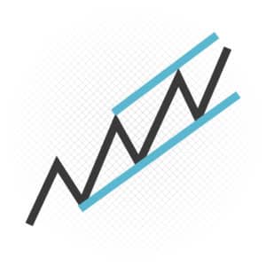
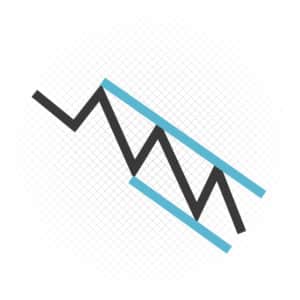
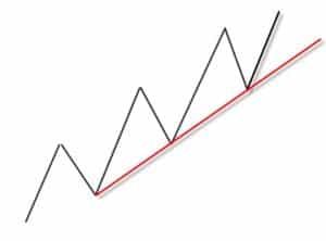
Ascending Channel
An ascending channel sees price contained within up sloping parallel lines. Higher swing highs and higher swing lows signal an uptrend with the support trend line drawn connecting the swing lows; the upper line of the channel is a parallel line drawn on the first key swing high between the lows that define the trend line support. A break above an up channel signals accelerated extension. A break below the trend line as support, can signal trend change.
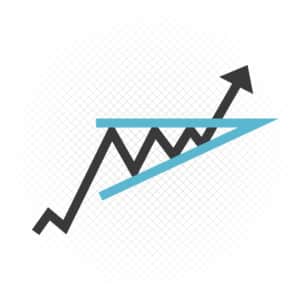
Ascending Triangle
A bullish pattern: An ascending triangle has a horizontal trend line that halted price rises and a second trend line connects successive higher lows. A bullish signal is given when price breaks above the horizontal trend line as resistance.
Average Directional Index – ADX
An value for the strength (not direction) of trend. ADX shows trend strength irrespective of if it is down or up. ADX is usually plotted with the DMI (Directional Movement Indicators, see below) and is calculated from the DMI lines.
Average True Range – ATR
Developed by Welles Wilder (New Concepts in Technical Trading Systems), ATR is an indicator of volatility.
The True Range is calculated as the largest of:
- difference between the current high and the current low
- absolute difference between the current high and the previous close
- absolute difference between the current low and the previous close.
The Average True Range is a Moving Average of the True Range.
B
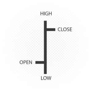
Bar Chart
A type of chart where the peak of a vertical line indicates the high price during a period of time and the bottom represents the low price. The opening price is shown on the left side of the bar, whilst the closing price is displayed on the right side of the bar. Bar can be set to represent various time frames.
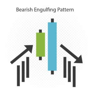
Bearish Engulfing Pattern
A candlestick pattern whereby the body of a black (bearish) candlestick engulfs the body of the previous candlestick.
Bollinger Bands
A simple moving average is plotted and a “band” plotted 2 standard deviations from the moving average (developed by John Bollinger).
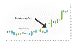
Breakaway Gap
A breakaway gap is a gap in the movement of an asset price reinforced by high volume.
Broadening Formation
A pattern that develops when an asset price displays significant price movement (during high volatility), but with little direction. The pattern is made up of a series of higher swing highs and lower swing lows. Trend lines drawn over the swing highs and under the swing lows define the widening pattern. Also known as a megaphone.
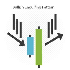
Bullish Engulfing Pattern
A candlestick pattern whereby the body of a white candlestick (bullish) engulfs the body of the previous candlestick.
C
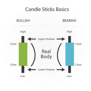
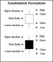
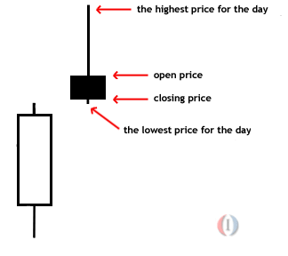
Candlestick
A price chart that displays the high, low, open, and close for a period of time. The “real body” is the wide part of the candlestick and is the difference between the opening and closing prices and indicates if the close was higher or lower than the open. Usually black or red on a higher close and white or green on a lower close. The shadows display the high and low of the period. Differing candlestick shapes have differing implications and thereby are either bullish or bearish.
Consolidation
Price movement within a defined range, reflecting a period of indecision. This concludes when price breaks out of the range barriers.
Coppock Curve
A long-term indicator used to identify major bottoms in a market (traditionally equity markets/ indices). It is a 10 month weighted Moving Average of the sum of the 14-month Rate of Change (ROC) and the 11-month ROC.
Corrective Waves
Price action against the main trend, from Elliot Wave theory. Elliot Wave theory predicts that price movements occur in cycles and that movements are fragmented into motive waves and corrective waves. Motive waves are in the direction of the trend, whilst corrective waves are movements counter to the prevailing trend.
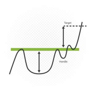
Cup and Handle
A chart pattern that looks like a “cup” with a “handle”. The “cup” is a “U”, whilst the “handle” has a downward corrective form. The “handle” side of the pattern tend to have lower trading volume. It can be as short as seven weeks and as long as 65 weeks.
D
Death Cross
A Death Cross occurs when the short-term moving average (usually 50-day) breaks below the long-term moving average (usually 200-day). Usually applied to equities and equity indices.
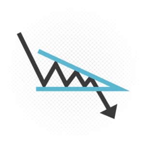
Descending Channel
A descending channel sees price contained within down sloping parallel lines. Lower swing descending lows and lower swing descending signal a downtrend with the resistance trend line drawn connecting the swing highs; the lower line of the channel is a parallel line drawn on the first key swing low between the highs that define the trend line resistance. A break below the down channel signals accelerated extension. A break above the trend line as resistance, can signal trend change.
Descending Triangle
A bearish pattern: A descending triangle has a horizontal trend line that halted price falls and a second trend line connects successive lower high. A bearish signal is given when price breaks below the horizontal trend line as support.
Diamond Top Formation
A reversal pattern in the shape of a diamond that often signals the end of a bull trend. This is an uncommon pattern and is defined by the price action widening and then narrowing.
Displaced Moving Average
A moving average adjusted forward or back in time to forecast trends.
Divergence
Divergence is when price and an indicator (usually a momentum indicator) move in opposite directions. Divergences are often a signal for potential shifts in price direction.
Bullish divergence occurs when price makes a new low whilst the indicator does not (and often rises). Bearish divergence occurs when price moves to a new high, but the indicator does not (and often falls).
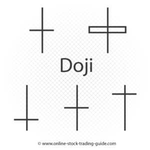
Doji
A doji is a candlestick pattern when the price at the open and close are nearly equal. These can be indicators on their own, but also occur in multi-period candlestick patterns.
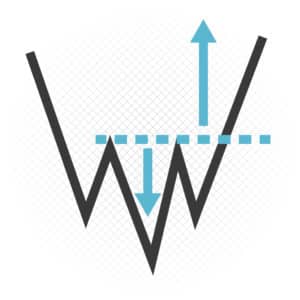
Double Bottom
In a down trend, a Double Bottom pattern occurs when price falls on two occasions to similar levels and holds. If the price breaks back above the interim peak between the lows, then a Double Bottom pattern is formed pointing to higher price action.
Double Top
In an uptrend, a Double Top pattern occurs when price rises on two occasions to similar levels and holds. If the price breaks back below the interim low between the peaks, then a Double Top pattern is formed pointing to lower price action.
Down Trend
The price movement when the overall direction is down. A Dow Theory downtrend occurs when each successive high and low is below the previous ones earlier in the trend.
E
Elliott Wave Theory
Elliott Wave theory suggests that markets moves higher in a sequence of 5 waves and correct lower in a series of 3 waves.
Envelope
An Envelope is defined by two moving averages that outline upper and lower price ranges and uses to identify overbought and oversold conditions.
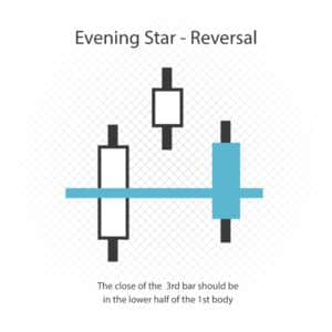
Evening Star
A 3 candles bearish candlestick pattern:
- A large 1st up candlestick located within an uptrend.
- The 2nd bar is a candle with a small body (usually up) that closes above the 1st up bar (usually with a gap).
- The 3rd bar is a large down candle that opens below the 2nd candle and closes below the midpoint of the 1st bar’s body.
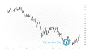
Exhaustion Gap
A gap after an accelerated price rise that starts to stall. An exhaustion gap frequently signals a potential trend end.
Exponential Moving Average – EMA
A moving average, whereby more weight is given to the latest data. The weighting for older data falls exponentially (never reaching zero).
F
False Breakout
A price break through a level of resistance or support that does not maintain its direction.
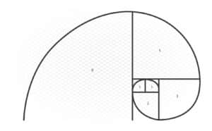
Fibonacci Sequence/ Numbers
Named after an Italian mathematician from the 12th century, Leonardo Fibonacci. They Fibonacci Numbers are a sequence of numbers whereby each number is the sum of the two previous numbers. So,
1, 1, 2, 3, 5, 8, 13, 21, 34, 55, 89, 144, …
Moving to the nth degree, any given number is approximately 1.618 times the preceding number.
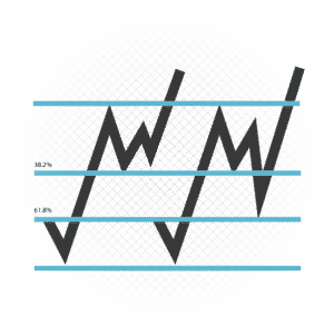
Fibonacci Retracements
Areas of support or resistance defined as the potential retracement of an original price move. Fibonacci retracements are horizontal lines of support or resistance defined by important Fibonacci levels of 23.6%, 38.2%, 50%, 61.8%.
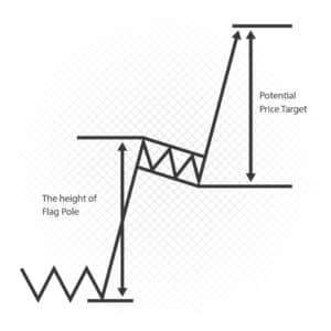
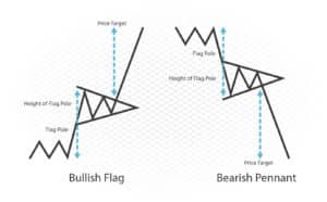
Flag
A pattern that looks like a flag with a mast. Flags represent a corrective consolidation after a usually sharp, accelerated move, before the initial move resumes.
G
Gann Angles
The ideal balance between time and price exists when prices move identically to time, which occurs when the Gann angle is at 45 degrees. In total, there are nine different Gann angles that are important for identifying trend lines and market actions. When one of these trend lines is broken, the following angle will provide support or resistance.
Golden Cross
A crossover involving a security’s short-term moving average (such as 50-day moving average) breaking above its long-term moving average (such as 200-day moving average).
H
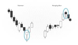
Hammer
A candlestick price pattern when a market trades considerably lower than its opening, but rebounds to close above or near the opening price. This forms a hammer-shaped candlestick pattern.
Hanging Man
A bearish candlestick pattern usually seen at the end of a bull trend. It is formed from a significant sell-off after the open, but then a rebound near to the opening level.
Head And Shoulders
A technical analysis term used to describe a chart formation in which the market:
- Rises to a high and then declines.
- At that point, the price rises above the previous peak and again drops.
- And finally, price rises again, but not to the second peak, and falls again.
The first and third peaks are shoulders, and the second peak forms the head.
I
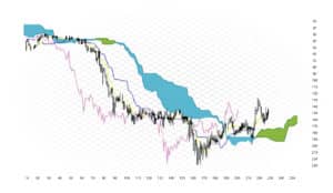
Ichimoku Cloud
A technical analysis approach that combines trend direction analysis, momentum, support and resistance It defines bullish and bearish crossovers uses a combination of moving averages (known as the kijun-sen and tenkan-sen). “Clouds” (kumo) are the areas between the average of the tenkan-sen and kijun-sen plotted six months forward and the midpoint of the 52-week high and low, again plotted six months forward.
Impulse Wave Pattern
A strong move in an asset price in direction of the underlying trend (from Elliot Wave analysis).
Inside Day
A daily price range for an asset that is within, contained by or “inside” the price range of the previous day. A type of harami candlestick pattern and can potentially signal a change in trend direction.
Inverse Head and Shoulders
A technical analysis term used to describe a chart formation in which the market:
- Falls to a low and then rebounds.
- At that point, the price falls below the previous low and again rebounds.
- Finally, price falls again, but not as far as the second low, and rebounds again.
The first and third lows are shoulders, and the second low forms the head.
Inverse Saucer
A reversal chart pattern that shows a market which has hit its high and the uptrend has concluded. It is categorized by a flattening of the uptrend to a sideways range, then a slowly fall and finally a quickening downward. Also described as a Rounded Top.
Island Reversal
This occurs when a market gaps up (or down), then trades higher (lower) from the gap, then gaps down (up) through the initial price. This leaves the activity as an “island” and is a strong sign of a likely reversal.
L
Line Chart
A chart simply by connecting a series of price (or data points) together with a line, for a market price this is usually the closing price. A very basic type of chart and not often used by technical analysts, if open, high, low and close data is available.
Linear Price Scale
A vertical chart scale for price used whereby values on the scale are spaced equidistantly. Each unit of change is signified by the same vertical distance, irrespective of the price level from which the change occurs. This price scale is primarily used in short-term trading, whereas the “logarithmic price scale” is used for longer time frames.
Logarithmic Price Scale
A vertical chart scale for price used whereby values on the scale are placed so that two equal percent changes are denoted by the same vertical distance on the scale. Therefore, the distance between the numbers on the scale decreases as the price of the underlying asset increases. Also known as a “log scale”.
M
Market Breadth
An analysis of the overall direction of an index or average by analyzing the number of stocks rising (advancing) compared to the number falling (declining). A positive market breadth happens when more stocks are advancing than falling and implies that the bulls are in control. A positive market breadth happens when more stocks are advancing than falling and implies that the bulls are in control. Negative market breadth is when more stocks are declining than rising and implies that the bears are in control.
McClellan Oscillator
A specific Market Breadth indicator derived from the difference between the number of advancing and declining stocks on the NYSE.
McClellan Oscillator = (19 day EMA of Advances – Declines) – (39 day EMA of Advances – Declines)
- When positive, i.e. above zero it is bullish.
- When negative i.e. below zero it is bearish.
Momentum
The rate of acceleration of market price. Price is likely to continue to move in the same direction, rather than to change direction and momentum is a measure of this. Momentum is an oscillator used in identifying trends.
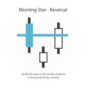
Morning Star
A three candles, bullish candlestick pattern:
- Bar One is a long, negative candlestick within a downtrend.
- Bar Two is a candle with a small body (direction is not important), but that closes below Bar One.
- Bar Three is a large positive candle which opens above Bar Two and closes near the middle of Bar One.
It indicates that the downtrend is likely to reverse.
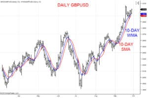
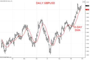
Moving Average – MA
Moving Averages (MAs) show the average value (price) of a market over a set period. Moving Averages are usually used to signal trend direction, and define potential support and resistance levels and measure momentum. MAs reflect trend direction and smooth out price fluctuations, or market noise, that can confuse interpretation.
Moving Average Convergence Divergence – MACD
A momentum indicator that is trend-following and is defined by two Moving Averages.
MACD = 12 period (day) Exponential Moving Average (EMA) – 26 period (day) EMA
The Signal Line is a 9 period (day) EMA of the MACD, plotted over the MACD and used as a trigger for buy and sell signals.
O
OHLC Chart
OHLC or Open, High, Low, Close chart simply shows the opening, high, low and closing prices.
On-Balance Volume – OBV
A reflection of momentum relating to volume and price change. OBV is an aggregate total of volume and reflects if volume is flowing in or out of a market. Total volume each day is allocated positive or negative depending on whether price is higher or lower each day. A higher close see OBV having a positive impact and rising, whilst a lower close sees a negative value and sees OBV fall.
An upward sloping OBV would confirm an uptrend; a downward sloping OBV confirms a downtrend. A falling OBV when price is trending higher suggests that maybe traders/investors are beginning to exit long their positions and maybe a shift in trend could occur.
Outside Reversal Day
A daily price pattern whereby a market posts both a higher high and a lower low that on the previous trading day. A higher close would signify a positive outlook and a Bullish Outside Day, a lower close signals a Bearish Outside Day and indicates a negative bias.
P
Pennant
A continuation pattern after an accelerated and significant movement in a market (the flagpole), after which a consolidation phase sees converging trend lines for a pennant shape. This is then predicted to produce a breakout in the same direction as the initial large move, with the second part of the flagpole then forming.
Pivot
A price level seen as significant because the market is unable to penetrate it or because it is breached and causes an accelerated move through that price level (sometimes with an increase in volume).
R
Range
A market’s low and high price for a particular trading timeframe.
Rate Of Change – ROC
A momentum indicator measuring the percentage change between the most current price and price “n” periods before.
Calculation:
(Current Closing Price- Closing Price “n” Periods Previous) / Closing Price “n” Periods Previous
Real Body
The wider part of the candle, in candlestick analysis, which represents the difference between the open and the close for any particular timeframe.
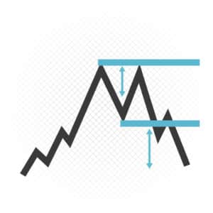
Rectangle
A price pattern whereby a market is confined within a defined range, where support and resistance levels are effectively parallel, thereby appearing as a rectangle. A breakout from the rectangle signifies a new directional theme.
Relative Strength Index – RSI
A momentum indicator that determines overbought and oversold conditions by comparing the size of recent gains versus recent losses.
Calculation:
RSI = 100 – 100/(1 + RS)
Where RS = Average gain on up periods/ Average losses on down periods.
Retracement
A transitory change in direction of a market’s price, counter to the prevailing trend. A retracement does not indicate a change in the underlying trend, but rather a correction of the prevailing trend.
Reversal
A change in the direction of a trend. For example, in an n up trend, defined as a series of higher highs and higher lows, a potential reversal into a down trend could be indicated by the breaking of the consecutive series of higher highs and starting a phase of lower lows and lower highs. This could also be signaled by a break through a trend line, or through a Moving Average.
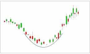
Rounding Bottom
A chart pattern that appears in the form of a shallow “U”. Rounding bottoms are very often seen towards the conclusion of a longer term down trend and potentially the start of a more notable up trend. This pattern usually builds over a longer term timeframe of weeks or even months.
Rounding Top
Similar to the Rounding Bottom pattern, but in this case, an upside down “U”. A Rounding Top often occurs at the end of a longer term uptrend and often weeks or months to build.
S
Saucer
Another name for the Rounding Bottom. A pattern that appears as a “U”. Sources are usually seen towards the end of a longer term down trend and start of a more notable up trend. This pattern tends to develop over longer term timeframes, weeks or even months.
Sentiment Indicator
Usually a numerical indicator, which indicates how market participants feel about a market or economy. Sentiment Indicators try to quantify how economic factors (e.g. unemployment, inflation) effect future behavior.
Shadow
The narrow lines seen on candlestick patterns, which indicate the extremes of the periods trading activity. The Shadow is the distance between either the open or close and the high or low.
Shooting Star
A bearish candlestick formation that indicates that price moved significantly higher during a trading period, but then returned back lower to close back near to the opening price level.
Sideways Trend
A sideways trend is not really a trend at all, but rather a consolidation, range phase. During this sideways trading environment market is within equilibrium, but searching for the next significant directional theme. Usually a breakout from the Sideways Trend indicates a new directional bias.
Simple Moving Average – SMA
A Simple Moving Average is calculated by summing the closing prices for a defined number of time periods, then dividing by the number of time periods. Shorter Moving Averages are more responsive to and generally closer to current price than longer Moving Averages.
Spinning Top
A candlestick pattern in which the real body is small, but with a wider price range throughout the time period. This pattern is regarded as neutral and indicating indecision as to future price direction.
Stochastic Oscillator
A momentum indicator comparing the closing price of a market to the price range over a time period. It is best used in non-trend trading environments.
Calculation:
%K = 100[(C – Lₓ)/ (Hₓ – Lₓ)]
C = the last closing price
Lₓ = the lowest price of the x prior sessions
Hₓ = the highest price of the x prior sessions
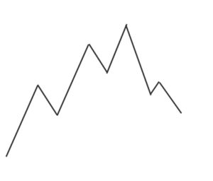
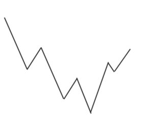
Swing High
A swing high is the high price of an asset, which is higher than a defined number of highs either side of it. A sequence of successively higher swing highs signals an uptrend.
Swing Low
A swing low is the low price of an asset, which is lower than a defined number of lows either side of it. A sequence of successively lower swing lows signals a down trend.
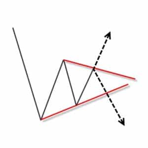
Symmetrical Triangle
A pattern defined by two converging trend lines, which are drawn by connecting a series of lower highs and a series of higher lows. This forms a Symmetrical Triangle pattern, which defines a consolidation phase. The breakout from this Symmetrical Triangle, signalled by a push above or below one of the trend lines signifies a new directional trend. This is usually (though not always) in the direction of the prevailing trend before the Symmetrical Triangle was formed.
T
Three Black Crows
A bearish candlestick formation, signalling the conclusion to a prolonged up trend and potential for a new down trend. This formation is defined by three successive long-bodied candlesticks, with each close lower than the previous.
Three White Soldiers
A bullish candlestick formation, signalling the conclusion to a prolonged down trend and potential for a new up trend. This formation is defined by three successive long-bodied candlesticks, with each close higher than the previous.
Trend line
A line drawn connecting Swing Highs or Swing Lows, to define the current underlying trend. Trend lines represent support and resistance, with a break below or above a trend line signifying a reversal of a trend.
Triangle
A chart pattern created by drawing trend lines that narrow over time because of lower highs and higher lows. Differing triangle patterns include Descending, Ascending and Symmetrical Triangles. Triangles are similar to Wedges and Pennants.
Triple Bottom
A chart pattern indicating a reversal of a down trend. The pattern is created when price forms three lows around the same level. The Triple Bottom is confirmed when the price moves above the highest rebound point (Swing High) between the three lows.
Triple Top
A chart pattern indicating a reversal of an up trend. The pattern is created when price forms three highs around the same level. The Triple Top is confirmed when the price moves below the lowest setback point (Swing Low) between the three highs.
W
Weighted Moving Average
A Moving Average that assigns a larger weighting to the more recent price data than the Simple Moving Average. Calculated from the closing prices over a set time period and multiplying by the price’s certain position in the data series. These values are then summated, then divided by the sum of the number of time periods. The use of this Moving Average has been reduced by the use now of the Exponential Moving Average.