Chart Types
Standard trading platforms will allow traders to view price moves as trading charts in three main ways. Line charts are the simplest representation of price action. Bar charts include additional detail about important price levels of the period. Candlesticks go one step further than bars to also visually reflect the direction of the price moves in the session:
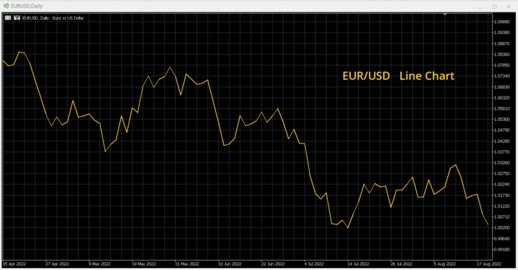
Line charts – A simple line links the close prices. Lines are good for beginner traders who may not like to be overwhelmed with information.
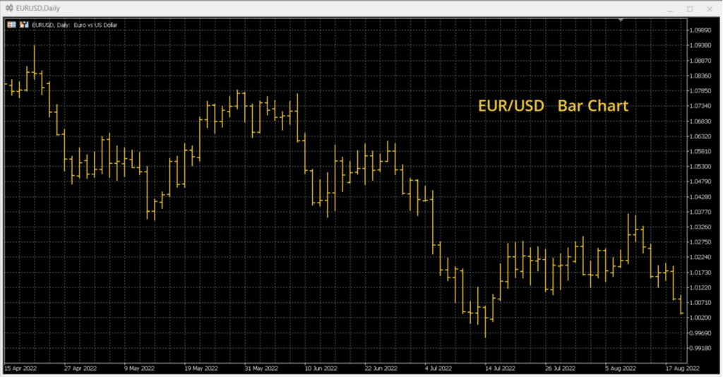
Bar charts – A bar is comprised of up to four pieces of important price information for the period. Prices for the open, close (or last price), session high and session low make up each bar. This gives more price detail than the line chart and is better for traders that are above the beginner level. Here is an example of bar charts being used.
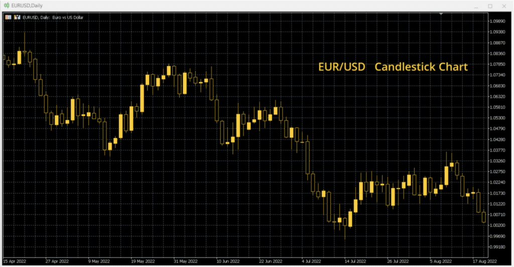
Candlestick charts – Candles have the same pricing information as bar charts, but also include details of the direction of price move from the open to the close (or the last price). This gives the most detail of the three chart types. Candles are mostly used by more experienced traders.
Other chart types
Other chart types are available in some charting packages/platforms. However, these tend to be more specialist analytical options. Point & Figure charts and Market Profile are two such chart types that some advanced traders like to use for their analysis.
| Line Charts | |
| Price action | A simple, single continuous line links the price from one period to the next. They can be used across any time frame. Takes the CLOSE price for each period. |
| Pros | Good for beginnersEasy to identify the trend of the price. Less messy presentation of the price than more detailed chart types, reducing the potential for “analysis paralysis”. |
| Cons | Lacks detail. Only one price represents the entire session. This means that it is harder to see how prices and trends are developing and potentially changing direction.Does not indicate trading volatility – this can mean that important reversal signals might be missed.Support and resistance levels become less certain, as do trendlines. |
| Bar Charts | |
| Price action | A vertical bar represents the price movement throughout each session. Uses OPEN, HIGH, LOW, CLOSE data. |
| Pros | Give a strong sense of how prices have moved within the sessionGood for novice and intermediate traders that are gaining confidence in their analysis |
| Cons | It can be hard to quickly identify the price move from one session to the next.Some software packages can lose the definition of the bars if the time horizon is zoomed out too far. |
| Candlestick Charts | |
| Price action | The most detailed of the standard chart types. Uses OPEN, HIGH, LOW, CLOSE data but also includes a visual representation of whether the price has closed higher or lower on the session. A candlestick “body” represents whether the CLOSE price is above or below the OPEN. A solid colour represents a move higher, whilst an empty candle represents a move lower (although most trading packages allow the trader to configure candles to suit their requirements) The candlestick “tails” or “shadows” represent the extreme prices of the session for the HIGH and LOW. |
| Pros | Candles provide the same price detail as Bar charts but are visually more striking.Good for more confident and experienced traders.Candlestick analysis has its own patterns over single and multiple periods, allowing traders to identify reversal or continuation signals. |
| Cons | As with Bar Charts, on most software packages, if the horizon of the chart is zoomed out too far, the candles will lose visual definition. |
